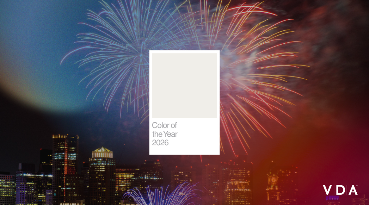
Embracing White: A Fresh Start for the Year Ahead
Pantone’s declaration of white as the Color of the Year immediately sparked a mix of skepticism and curiosity among the design team at VDA. White? It often feels like a safe choice to us —the default for minimalist design and neutral comfort zones, almost too basic. After all, it’s the color we mix with others to create vibrant hues; it feels more like a primer than a standout.
But as we dug deeper, our perspective shifted.
White holds immense potential. It symbolizes a fresh start, a blank canvas, much like the beginning of any great project. Every idea starts in white space, waiting for creative teams to layer in color, texture, and meaning. As we enter a new year, we’re choosing to embrace that blank canvas mindset—ready to bring bold creativity to new opportunities.
The Power of a Blank Canvas.
In the world of experiential marketing, the concept of a blank canvas can be incredibly powerful. White provides a neutral backdrop that allows other colors, textures, and designs to shine. It evokes feelings of cleanliness, simplicity, and calm; qualities that resonate with consumers seeking clarity in an increasingly chaotic world. Picture an experiential space designed with white as the primary color. It could serve as a serene environment where visitors can fully immerse themselves in the experience without distraction.
As we wrap up a successful 2025 and enter the new year, it’s easy to picture white as a beacon for a restart. We all use the guise of the new year to delay fresh starts, new goals, and resolutions. In order to continue to push past boundaries and create innovative spaces and experiences, taking a moment of reflection to stare at the blank canvas can be just the restart we need.
White with a Touch of Warmth.
What excites us most about this year’s white is its potential for warmth; it doesn’t have to be stark or sterile. With the right accents, white can convey warmth and approachability, encouraging engagement and interaction. By incorporating soft off-whites or creamy tones, we can create inviting spaces that feel more like home. This warmth can be crucial in connecting with audiences on an emotional level.
In our campaigns, we can use this warm white as a backdrop for storytelling, allowing our narratives to take center stage. It serves as the perfect foundation for highlighting innovative products, showcasing unique experiences, or simply celebrating the joy of new beginnings.
Designing for Impact.
As we embrace white as a design element, we can explore how it interacts with other colors and materials in our campaigns. While combining white with warm tones can solicit comfort, incorporating bright, vibrant colors can invoke creativity and innovation. Pairing white with different color combinations can truly and subconsciously change the way your attendees feel and interact within your footprint. It can also act as a canvas for bold typography, vibrant imagery, or striking textures that draw the eye and create memorable experiences.
While our initial reaction to Pantone’s choice of white might have felt boring, we now see it as a powerful opportunity for creativity and innovation. This year, let’s embrace white as a fresh start- a blank canvas that invites us to design experiences that resonate deeply with our audiences. By injecting warmth and personality into this timeless color, we can create impactful, memorable campaigns that celebrate the new possibilities that lie ahead.
Together, let’s get creative with Pantone’s Color of the Year and make “Cloud Dancer” the mindset of 2026.